
Mastering Color Balance in Interior Design
- Danielle Kyle
- Apr 6, 2025
- 4 min read
Updated: Oct 14, 2025

History in the Layers: The Color Journey of a Home
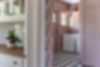
When you walk into a historic home, it’s easy to be drawn to its character; the subtle plaster texture, the intricate millwork, and the little imperfections that tell a story. Windows with wavy glass let light spill across these surfaces, and every corner seems layered with history. The good news is you don’t need an old house to enjoy that feeling! You can bring that same depth and warmth into new construction or a fresh remodel.

How to Create a Layered Palate
You can bring the charm of historic homes into new construction with a few thoughtful touches. Simple finish carpentry, layered trim, and moulding can add depth and interest, while modern plaster or wood paneling gives rooms texture and character. Pairing these elements with carefully chosen colors makes a home feel warm, layered, and full of personality, blending classic charm with modern design. A few ideas you can discuss with your builder or designer include:
Layered trim and moulding: Adding an extra strip of trim (backband) or routed edges can make walls and doors feel more detailed and polished.
Thoughtful carpentry cuts: Small adjustments, like true mitered corners, coping, or routed edges in cabinet trim or built-ins can subtly elevate a room without overwhelming it.
Materials that feel real: True tongue and groove paneling, embracing natural stone, or textured plaster will bring a sense of craftsmanship and longevity to modern spaces.
From historic to contemporary these touches in new construction homes create rooms that feel like they’ve always been there.

Using Color Balance to Create Depth
Color is one of the simplest ways to bring depth, personality, and warmth into your home. By layering tones thoughtfully and pairing them with textures and finishes, you can unlock a more nuonced approach to color; one that infuses modern spaces with the same depth and character that draws us into an older home. Color is more than aesthetic. When used intentionally it evolves from a casual, visual interest to a foundation of design. create spaces that feel both inviting and full of character. If you are looking for a color accent then limit the color in more saturated doses. If you are looking for an enveloping feeling broaden your horizon and deep dive into your color selections.
Tip: Don’t treat colors in isolation. Look at how your wall, trim, furniture, and flooring work together. A color that looks perfect on a sample card may look completely different once it’s paired with your lighting and materials.

White as a Design Tool: Elevating Light and Structure
The antithesis to layering color is a very strong and intentional use of white. Often regarded as a passive backdrop, white, when applied thoughtfully, becomes a powerful tool in both lighting and structure. When used thoughtfully, it:
Highlights architectural details like moulding, cabinetry, and beams
Makes rooms feel brighter and more open
Provides a neutral backdrop for furniture, artwork, and décor
Tip: Coordinate paint finishes across walls, trim, and cabinets. Matte for ceilings, eggshell for walls, and satin finishes for trim. These all will reflect light differently, which affects the overall look and feel of the space. If you want a truly neutral white then paint the trim, walls and ceiling all the same shade, not sheen of white.

A Guide to Color Balance in Interior Design
Achieving color balance in interior design goes beyond color and material. It’s about creating sensory harmony in your home. Just like our lives, a home’s story unfolds over time, and in new construction, we replicate this journey by layering; from colors, textures and patterns we work to evoke a human connection. Just as whites should be compared next to each other, and layered mindfully, so should various shades and hues of color. Each must stand alone, but also shine brightest together. When thoughtfully chosen, colors act as a guide, leading the eye across a room. Every detail, from the texture of a fabric to the richness of a cabinet color, plays a role in shaping the room's atmosphere, and shaping our living experience.
At KB Homes & Interiors, we use thoughtful color choices to create balance and depth; bringing warmth, character, and timeless beauty to your home. If you’re ready to explore ways to enhance your home, consider contacting our team to learn more about our interiors design and build services.
The projects featured in today's post can be found in our portfolio.
All styled interior photos are by JE Photography & Design